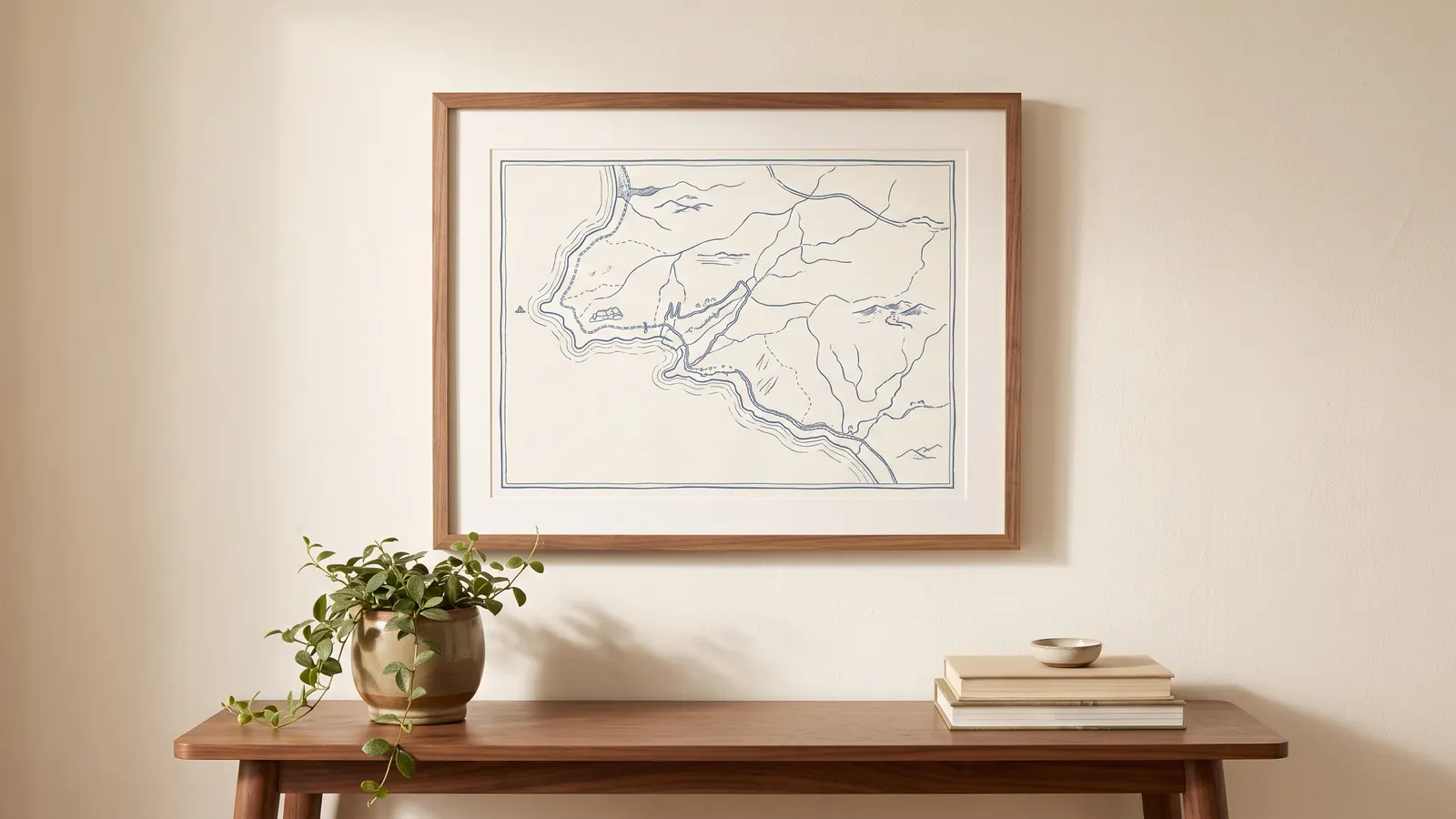
Some places deserve a spot on your wall: the street where you grew up, the city where you met or the neighborhood you now call home. We write about custom art and prints that bring those connections into a room, with practical ideas for choosing a design, finding the right size and framing it.
Giving personalized art? Pick a place that means something to the recipient, check any names or dates carefully, and think about the colors already in their home. The personal detail matters - so does making it easy to live with.
Size and placement decide more about the final look than the design itself. A small print can get lost above a large sofa or a wide console table, while an oversized piece can overwhelm a narrow hallway or a reading nook. As a rough guide, wall art generally looks right when it covers somewhere between half and three-quarters of the width of the furniture below it, with eye level landing roughly in the middle of the piece.
Paper and framing affect how long a custom print holds up, not just how it looks on day one. Giclée prints on archival paper resist fading far better than standard inkjet prints, which matters for a piece that's meant to stay on a wall for years rather than a season. Glass or acrylic glazing protects against moisture and sunlight, and a mat around the print gives it breathing room so the image doesn't look cramped inside the frame.
Before you order, double-check every name, date and spelling in the proof the maker sends - custom pieces are usually made to order and can't always be returned over a typo. Our custom map prints guide below covers how styles, paper and framing affect the finished piece in more detail.